Shadowing my Top 10 Best World Cup Kits is the Top 10 Worst World Cup Kits. This one was a lot more difficult because they’re all actually pretty decent, but I gave it my best shot!
10. Russia Away
.jpg)
Does this need any describing? The Dark blue to light blue to white was a decent idea, but having it “blend” like it does and combining it with those stripes and some red on top is just not right at all.
9. Cameroon Away

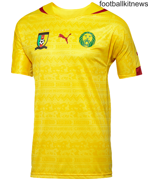
Although the home version did well in my Best Kits list, it falters here. It looks like a chewitt wrapper, it would have been fine without the patterns.
8. Belgium Home
I don’t get it. The colours are cool, but there’s too many things that don’t make sense. First of all, the crown, who decided that was necessary? Also, that stripe next to the badge is just ridiculous. The home kit had so much potential and I don’t see how you can make a beauty like their away kit but something like this.
7. Iran Home

I may be a bit harsh here but who puts an animal on their kit? The kit would actually be very good but adding that has ruined it. I understand that some Cheetah’s live in Iran but still, you don’t see England putting cows on their kits, or France putting garlic on theirs do you?
6. Mexico Away
.jpg)
Good idea, bad execution. Judging from their home kit, their away kit could have looked quite good. For once I think those shoulder stripes work, the colour is chosen well and the black at the end of the arms work well too. But really, why the zig zags? Spoils the whole thing, as well as the Adidas badge being in the middle while the badge is on the left (or our right).
5. Japan Away

I like the design of Japan’s kits, it’s just the colour of this kit. The colour isn’t bad, it’s just bad for this kit. White would have been much better (would fit the flag too) and I have no idea why they chose this. Maybe they wanted to stand out, well they’ve certainly succeeded.
4. USA Away
.jpg)
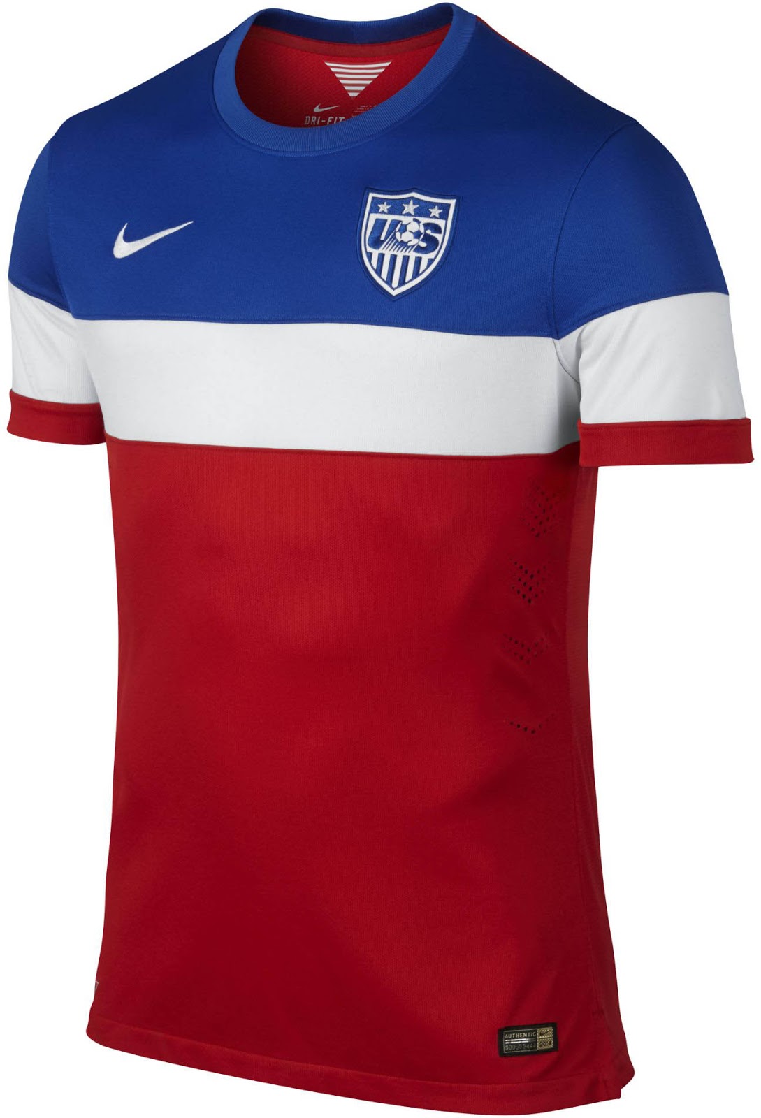
I get what they were after, they wanted their kit to represent their colours but they’ve done it in the worst way possible. I don’t see what’s wrong with a simple kit design but with some extra stripes or something, no need for this. I can’t wait to start laughing, I mean looking at what they look like when playing.
3. Croatia Away

I love the blue coloring, but those shoulder/shirt cubed stripes really do stand out and not in a good way. Nike have produced some pretty good kits and I know they wanted to keep that unique Croatian kit look but sometimes you have to leave things out, which is what they should have done here.
2. Italy Home
.jpg)
Perhaps the one everyone will disagree with me on. There’s too many colours, you have the gold Puma badges, the red/green of the flag, white on the flag/stripes and blue for the actual kit colour. There’s too much going on, simplicity is a virtue that should be utilised.
1. Ghana Home

I think they were deciding between making it really colourful or really bland and they eventually thought “Let’s do both at once, that’ll work!”. Truth is, it doesn’t. It actually looks a bit stupid, wouldn’t be so bad if they have balanced it correctly but you just look at it and think “I don’t get it”.


